Artificial Rainfall
2024
Branding design
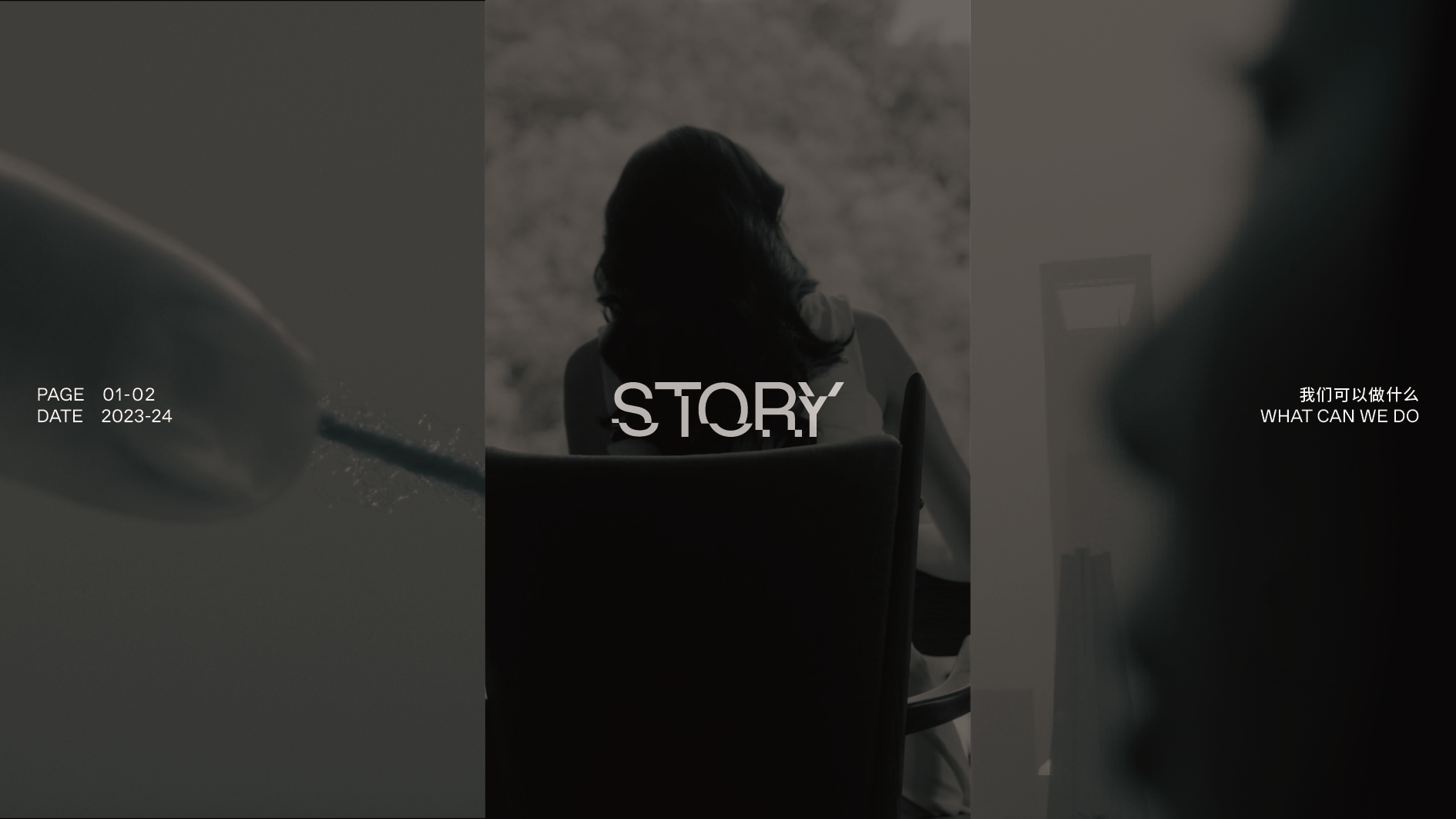
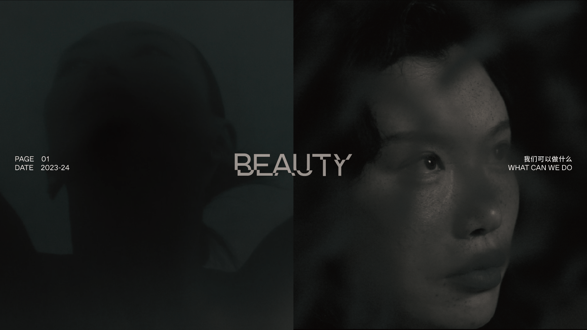
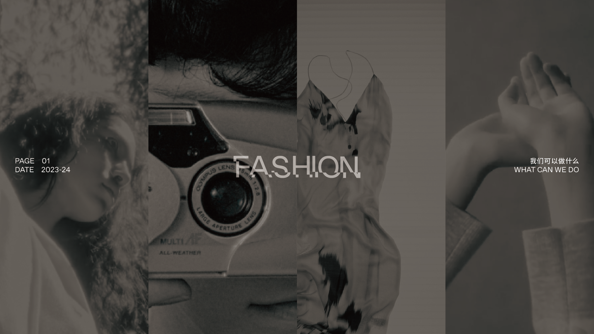
Artificial Rainfall 是一个影像工作室,我们为其设计了 Logo 与一套专属字体,并基于这一视觉语言拓展出完整的品牌识别系统。字体在字母 4/1 的位置进行了截断处理,形成类似水面倒影的视觉效果,呼应品牌名称中“Rainfall”的意象。
Logo 图形则以“下雨”的形态呈现,增加趣味性与辨识度。整体风格以几何方块为基础,带有强烈的马赛克感,暗示影像工作室与屏幕像素之间的联系,强化其数字媒介属性。
Artificial Rainfall is a visual production studio. We designed its logo and a custom typeface, which then evolved into a comprehensive brand identity system. The typeface features a deliberate break at the 4/1 point of each letterform, resembling a reflection on water—an echo of the brand’s name, “Rainfall.”
The logo itself is a playful interpretation of falling rain, adding a touch of visual interest. The overall aesthetic is built on strong, blocky, mosaic-like shapes, hinting at the pixelated nature of digital screens and reinforcing the brand's connection to moving images and digital media.